

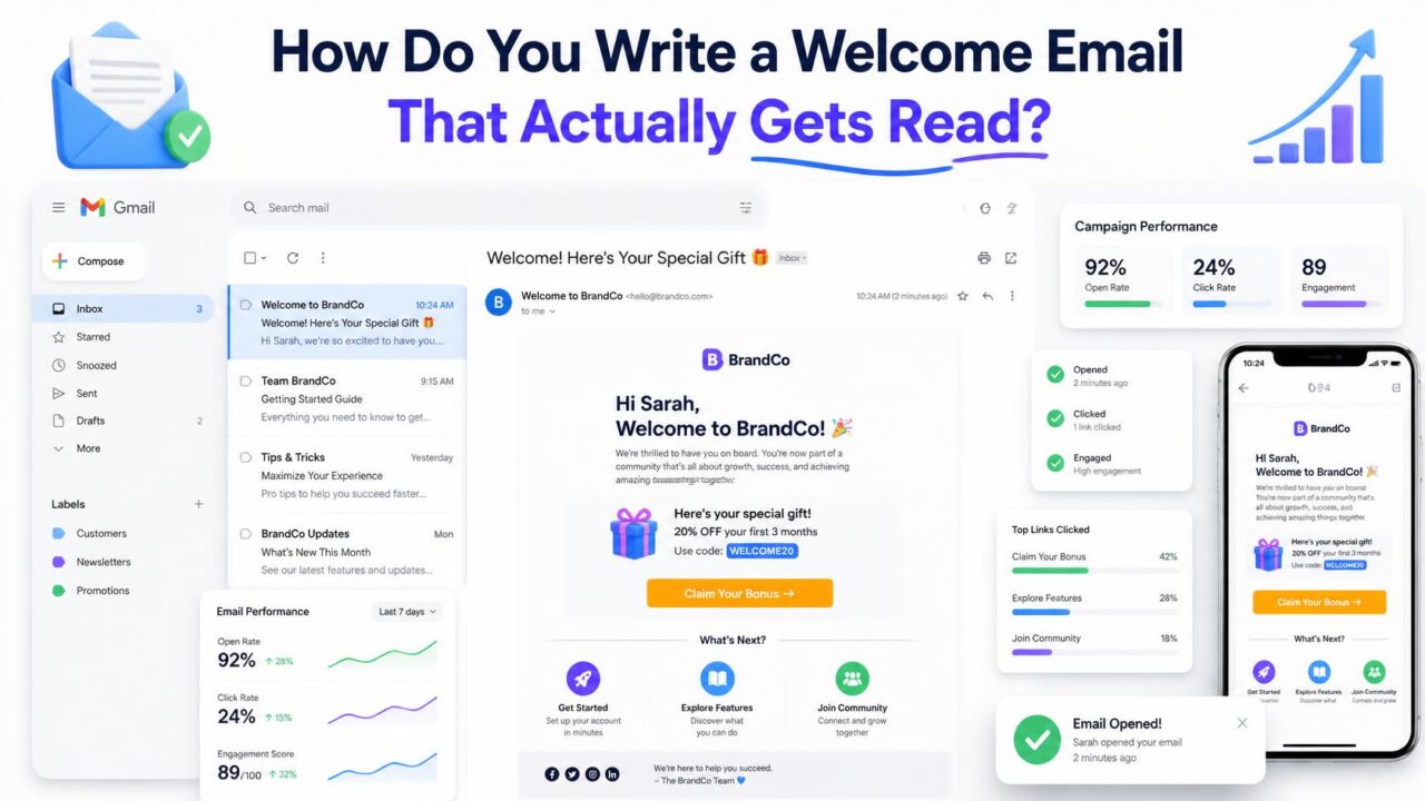
Quick answer: a welcome email that actually gets read is short, arrives within minutes of signup, sets one clear expectation about what you’ll send and how often, and asks for exactly one small action, not five. It typically gets the highest open rate of any email you’ll ever send to that subscriber, often several times your normal average, which makes it worth more editing attention than a single email usually deserves.
Why the welcome email matters more than any other single send
A new subscriber’s attention is at its highest point right after signing up, they just made an active decision to hear from you, and that decision is still fresh. Every email after this one competes with a growing pile of other things in their inbox and a fading memory of why they subscribed in the first place. This is also the moment a subscriber decides, often unconsciously, whether your future emails are worth opening at all, which makes the welcome email disproportionately influential on your engagement for months afterward.
When to actually send it
Immediately, or as close to it as your platform allows. If you’re using double opt-in, the welcome email typically follows right after the confirmation click, while the person is still actively engaged with the process they just completed. A welcome email that arrives hours or days later has already missed the moment of highest attention, and starts to feel like an afterthought rather than a genuine greeting.
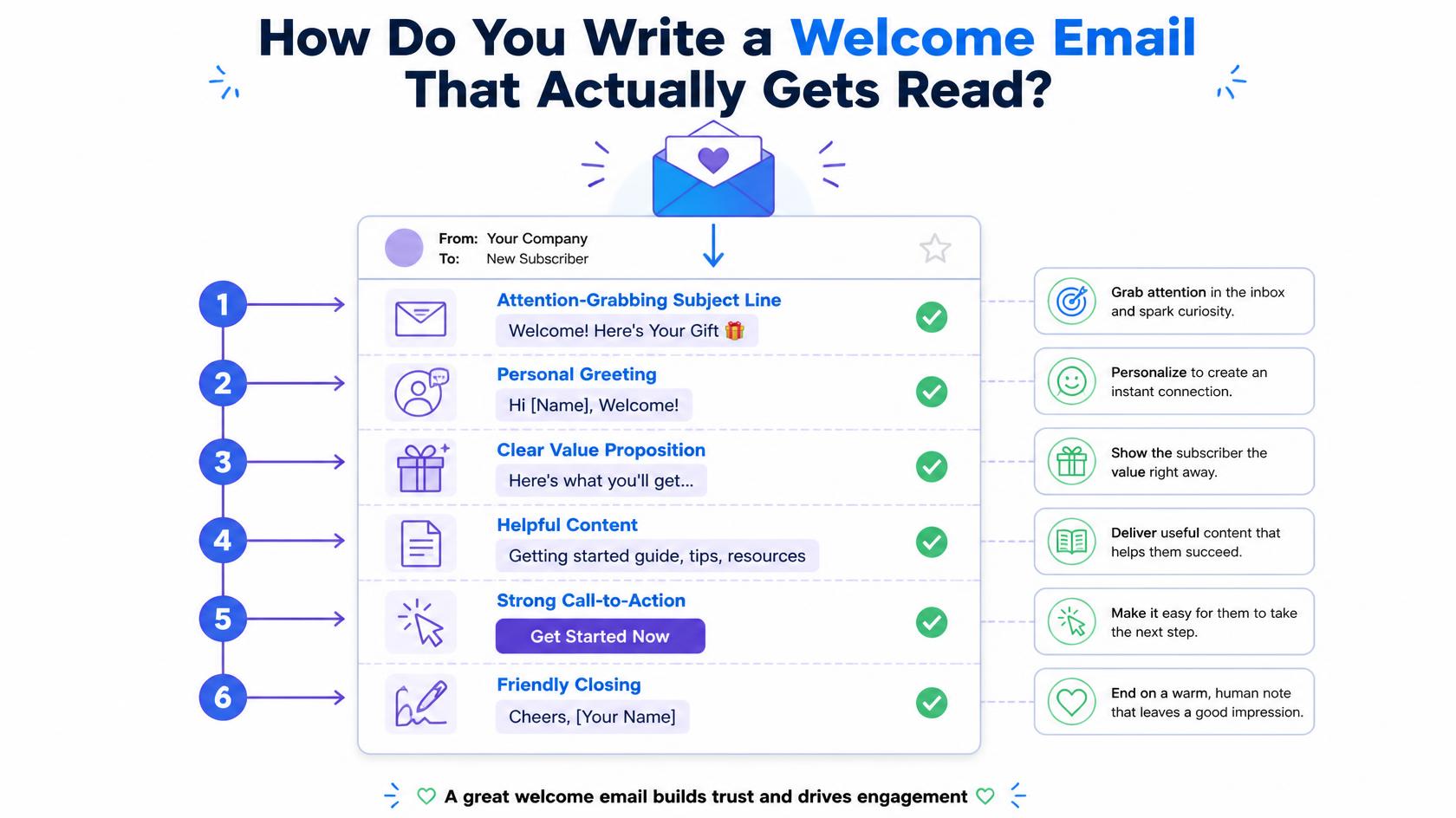
What actually belongs in it
- A clear, specific thank you that references what they actually signed up for, not a generic greeting that could apply to anyone.
- What to expect, stated plainly: roughly how often you’ll email, and broadly what kind of content, so nothing that follows feels like a surprise.
- One clear next step, not several. A single button or link asking for one small action, confirming a preference, checking out your best content, gets meaningfully more engagement than a list of five different things to do.
- A way to recognize you visually, a consistent sender name and, where relevant, a simple visual identity, so future emails are instantly recognizable rather than needing to be re-evaluated each time.
What to leave out
Resist the urge to cram everything valuable about your business into this one email. A welcome email trying to sell, educate, onboard, and upsell all at once usually accomplishes none of those well, and a subscriber skimming a dense wall of text on their first interaction with you is more likely to close it than absorb it. Save deeper content, full product tours, and secondary offers for the emails that follow, once the relationship has a bit more foundation.
Should you include a discount or incentive?
It depends on why people are signing up in the first place. If a discount was the reason someone subscribed, the welcome email is exactly where it belongs, delivered clearly and immediately, since making someone hunt for a promised incentive undermines trust right at the start. If the signup wasn’t tied to a specific offer, introducing a discount here can accidentally train subscribers to expect one before opening anything, which isn’t a habit worth building for its own sake.
Do you need more than one welcome email?
A short sequence of two or three emails over the following week or two, rather than a single message, works well for many businesses, since it spreads out what would otherwise be one overloaded email into a few focused, easily digestible ones. The first should still stand alone as a genuine welcome, with the following emails building on it rather than repeating it, each with its own single clear purpose.
Why a poor welcome email creates a lasting problem
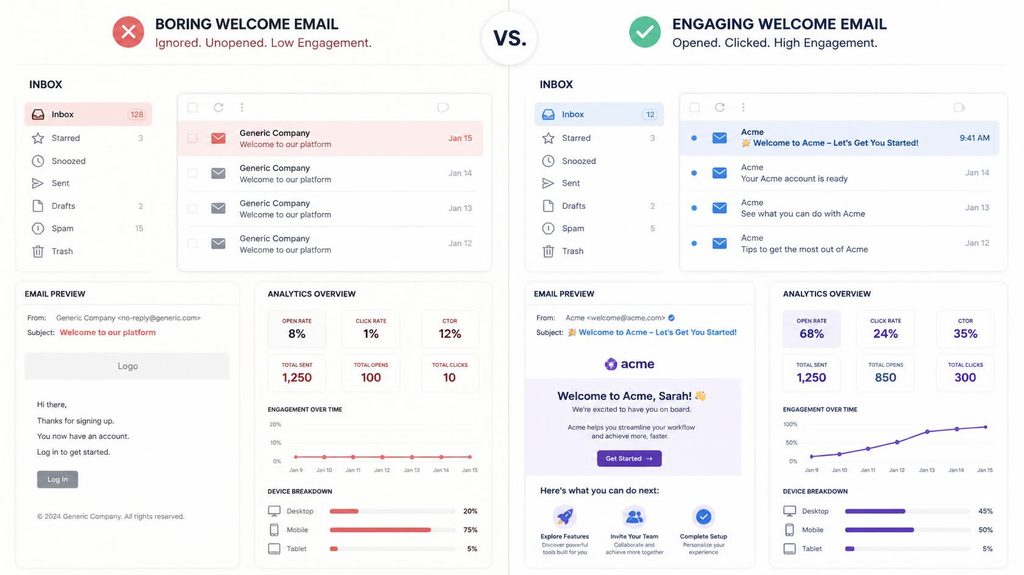
Someone who doesn’t open, or is unimpressed by, your welcome email is statistically less likely to open your next several emails too, since first impressions carry forward in how people triage their inbox. Over time, a large enough segment of subscribers who disengaged early can quietly drag down your overall sender reputation, since consistently low engagement from a meaningful part of your list is a real signal mailbox providers factor in, not just a vanity metric.
Personalization that actually helps versus personalization that’s just noise
Dropping a first name into the subject line or opening line is the most common form of welcome email personalization, but it’s also the shallowest, and on its own it does little to make the email feel genuinely tailored. More meaningful personalization references what the subscriber actually did to get here, the specific lead magnet they downloaded, the product page they were browsing, or the plan tier they signed up for, since this tells them the email was written with their specific situation in mind rather than blasted to everyone who joined that week. If you’re collecting any signup context at all, a specific interest, a referral source, a chosen preference, working even one of those details into the welcome email measurably outperforms a generic template with a name swapped in.
How to test whether your welcome email is actually working
Because welcome emails go to every new subscriber, they’re one of the easiest emails to run a genuine A/B test on over time, comparing two subject lines, two calls to action, or two levels of length against each other on a rolling basis rather than a one-time send. Track open rate and click rate specifically for this email as its own metric, separate from your regular campaign averages, since comparing it against a different kind of email tells you very little. If your welcome email’s open rate is only modestly higher than your regular campaigns rather than several times higher, that’s a sign something about timing, subject line, or deliverability is holding it back from the performance this email should naturally have.
The subject line does most of the work before anyone opens anything
A welcome email’s subject line has an easier job than almost any other email you’ll send, the recipient already expects it, so it doesn’t need to compete for attention the way a regular campaign does. That said, a generic “Welcome!” still underperforms a subject line that confirms what the person actually did, “You’re in — here’s what’s next” or naming your brand directly tends to outperform vague enthusiasm alone, since it reassures the subscriber their signup actually worked and tells them, before they even open it, that this email is worth their thirty seconds.
Mobile formatting matters more here than in almost any other email
A large share of welcome emails get opened on a phone, often within minutes of the person signing up on their laptop or completing a form on mobile in the first place. A welcome email with a wide multi-column layout, a tiny call-to-action button, or paragraphs that require pinch-to-zoom loses much of its advantage regardless of how well it’s written. Single-column layouts, a button large enough to tap comfortably, and short paragraphs that don’t require scrolling past the fold all protect the high open rate this email already has from being wasted on a poor mobile reading experience.
A simple welcome email checklist before you hit send
- Does the subject line confirm what just happened, rather than a generic greeting that could apply to any list?
- Is there exactly one clear call to action, not three or four competing links?
- Does it load and read cleanly on a phone screen, with a tappable button and short paragraphs?
- Does it set a specific expectation for how often you’ll email and what kind of content is coming?
- Is the sender name and address something the subscriber will recognize in their inbox next time, not a generic no-reply address that feels impersonal?
Timing it around when someone is most likely to actually check email
Beyond sending immediately after signup, there’s a secondary timing consideration worth a mention: if your automation allows any flexibility, being aware of roughly when your typical subscriber checks email can nudge open rates slightly higher. A B2B audience signing up during a workday is likely still at their desk and checking email actively, so an immediate send works well there. A consumer audience signing up late at night might have a welcome email arrive and get buried under a fresh batch of morning mail before they even see it. This is a minor optimization compared to getting the content and single-action structure right, but worth testing once the fundamentals are already in place.
A short example of what a working welcome email actually looks like
Put together, a working welcome email might open with a specific “Thanks for joining our weekly list on X” rather than a bare “Welcome!”, follow with one short sentence on what to expect, “Every Tuesday, one practical tip, nothing else,” then a single button linking to your best existing content or a simple preference confirmation, and close with a real name and a way to reply. Nothing about this requires design skill or a large time investment, the effectiveness comes from clarity and restraint, not production value, which is exactly why it’s worth getting the structure right before worrying about visual polish.
Frequently asked questions
How soon should you send a welcome email?
As close to immediately as your platform allows, ideally right after signup or confirmation, while the subscriber’s attention and intent are still fresh.
What’s a typical welcome email open rate?
Welcome emails commonly see open rates several times higher than a sender’s regular campaign average, since they arrive at the subscriber’s point of highest interest and intent.
Should a welcome email include a discount?
Only if a discount was the reason someone signed up in the first place. Otherwise, introducing one here can train subscribers to expect an incentive before opening future emails.
Do you need more than one welcome email?
A short sequence of two or three works well for many senders, spreading what would be one overloaded email into a few focused ones, each with a single clear purpose.
Does the sender name on a welcome email matter?
Yes. A recognizable, consistent sender name, ideally a real person or a clear brand name rather than a generic no-reply address, helps the subscriber identify and trust your future emails at a glance, which compounds over every send that follows.
Should a welcome email be plain text or fully designed?
Either can work, but simpler tends to perform better here. A clean, mostly text-based email with one clear button often feels more personal and reads faster on mobile than a heavily designed template competing for attention with the message itself.
Where to start
Write one email with one clear purpose before worrying about a full sequence. And make sure the list this email actually reaches is worth the effort you’re putting into it, PureListVerifier confirms new signups are real before your first, most important email ever gets sent to them.
